Forecasting in Excel offers a quick and efficient way to predict future trends by leveraging historical data. This Forecasting in Excel tutorial explains how to create forecasts in Excel, adjust confidence intervals, and integrate seasonality for improved accuracy.
To progress in Supply Chain, mastering Excel is essential. Then Forecasting with Excel will allow you to automate and simplify your work.
Download the Excel template to follow this tutorial step by step.

Forecasting in Excel: Visualizing a Trend
For our first example, we’re looking at COVID-19 cases around the world. You will find the data needed to follow this example in this Excel forecasting template.

The purpose of the exercise is to use Excel to forecast and estimate future COVID cases using a trend, which we will add to the graph. To create a trend line on a graph (here in red), right-click directly on the graph and select add a trend line.

The forecast menu will appear, allowing you to select the desired trend line.

What is interesting about this forecast menu is that you can easily make new forecasts by adding future calculation periods of COVID cases. Just add forecast periods (in days) in the lower part of the menu.

This will generate a new line chart graph, with a new curve, which will show future predictions.

Forecasting in Excel: How to make an Automatic Forecast?
For this exercise, we will select new data in our table. Here, we want the world data (World cases) and the number of days (Day).

When the columns are selected, click on Data, then Forecast Sheet in the top menu. You will get the following forecast sheet:
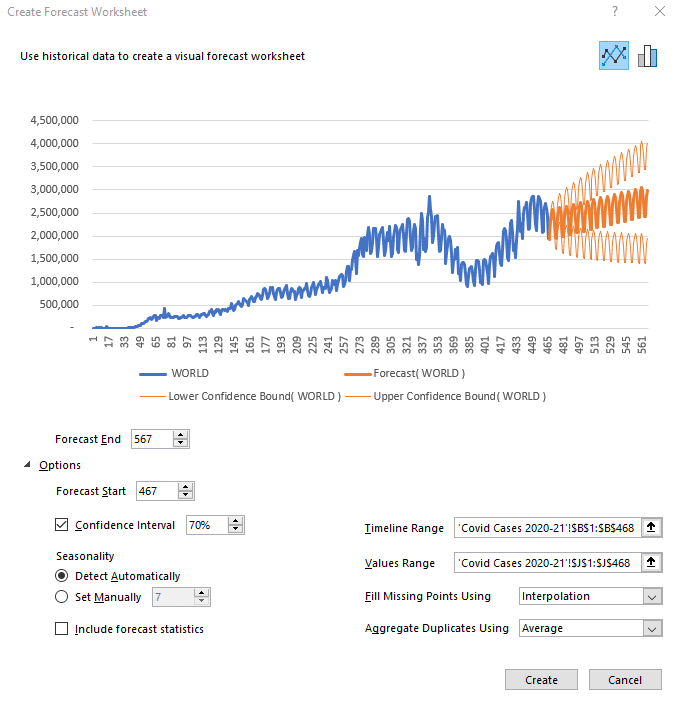
It is possible to change the number of days of predictions by clicking on Options below the graph. Simply add or remove the desired number of days in the Start and End boxes of the forecast.
The other interesting option you can play with is the confidence interval. What is the confidence interval? It is simply the probability of the forecast. The orange part of the graph shows a high forecast hypothesis and a low forecast hypothesis. If your confidence interval is 70, then there is a 70% chance that the prediction is between the high and low assumptions.
The last option to look at is Seasonality, which means the seasonality of your forecast. Microsoft Excel detects patterns of change in the data and includes them in its forecast. For example, in our COVID cases, there is a drop in test results on Sundays and Mondays because the number of tests performed drops at the weekend. This change is taken into account when Excel makes its future forecast.
Once you have selected the desired parameters, click Create to see the forecast data calculated by Excel spreadsheet in a table format. The Day column shows the days, the World column shows the COVID cases in the world up to day 467, where our data points end. The Forecast column is the beginning of your future forecast, the Lower Confidence Bound column represents the low hypothesis, and finally, the Upper Confidence Bound column indicates the high hypothesis.

Forecast sheet: the Case of India
For the rest of our tutorial, let’s look at the case of India. By selecting the specific case column for India in our original data table, as well as the number of days, we obtain this forecast:

However, the forecast looks strange compared to historical data. Why is that?
The selected period is too long and Excel can’t detect a seasonal pattern. We can therefore define it manually (7 days). Also, we must ask ourselves: does the past period reflect what will happen in the future? Here, unfortunately, it will not, so we will focus on the second peak instead of the first.
To select the period of interest, click on Cancel. Click on the COVID CASES 2021 tab at the bottom of the spreadsheet, then select the Day and India columns again.

Then, click on Data and generate a new Forecast Sheet.

Manually redefine the end of the forecast and the seasonality and you will get something that looks much more like reality. It is always important to visualize the low and high hypotheses (companies don’t do this enough) as they correspond to the Best-Case and Worst-Case scenarios, which can be critical information for your performance.
Here’s how to make a forecast in Excel in just a few clicks. In the next part of our tutorial, we will try to forecast car sales in the USA for the next few months.
Sales Forecast (U.S. Car Since 1976)

This is the database to work with on this sale forecast. It’s interesting to see this curve, which shows a slight increase right now and helps us visualize the different crises that have hit the US since 1976 (the oil crisis, the 2008 crisis, and finally the COVID crisis).
Once again, to see the forecast, select the sales per month and the total sales (the last 2 columns).

To have a more coherent forecast, let’s revise the end of the prediction downwards and put a confidence interval of 50%. We can see that Excel has detected a seasonality in this graph. Thanks to the data, we can see that there is a crisis about every 181 months. You can change this as you wish. Here I have changed the seasonality to show a change every 12 months.

And so here is the new forecast. Of course, these predictions are not perfect. You can always add new trends, new mathematical models, market research, competitive research into your data analysis. All of which will impact your sales forecast.
But the important thing in this exercise is to understand how to do make your own automatic forecasts in Excel, to see how simple it is to master this tool. Indeed, mastering the art of forecasting is the best way to develop the profitability of a company, to improve performance and customer satisfaction.
Frequently Asked Questions on Forecasting in Excel
How can I visualize a trend in Excel using historical data?
To visualize a trend, input your historical data into Excel and create a line chart. Right-click on the data series, select ‘Add Trendline,’ and choose the appropriate trend type, such as linear or exponential, to observe the data’s trajectory.
What steps are involved in creating an automatic forecast in Excel?
Select your data series, navigate to the ‘Data’ tab, and click on ‘Forecast Sheet.’ Excel will generate a forecast with options to adjust the forecast’s end date and confidence intervals. This feature simplifies predicting future values based on historical trends.
How does Excel handle seasonality in forecasting?
Excel can automatically detect seasonality patterns in your data when creating forecasts. Alternatively, you can manually set the seasonality parameter to ensure the forecast accounts for regular fluctuations, such as monthly or quarterly cycles.
Can I adjust the confidence interval in Excel forecasts?
Yes, when creating a forecast, you can set the confidence interval percentage. This determines the range within which future values are expected to fall, providing an estimate of forecast reliability.
How accurate is Excel’s forecasting?
While Excel provides a quick, accessible method for forecasts, its accuracy depends on data quality, chosen confidence levels, and correct seasonality settings.